Starlight Investments
Starlight came to us at a point of rapid growth. Since 2011, the company had significantly expanded its portfolio and audience base, but its brand and digital presence hadn’t kept pace. The opportunity was to define a more distinct and ownable brand that could scale, better differentiate in market, and clearly communicate its offerings to a range of audiences.We developed a cohesive visual identity and redesigned the website to create a more modern, unified experience for investors, partners, and residents.
My Role
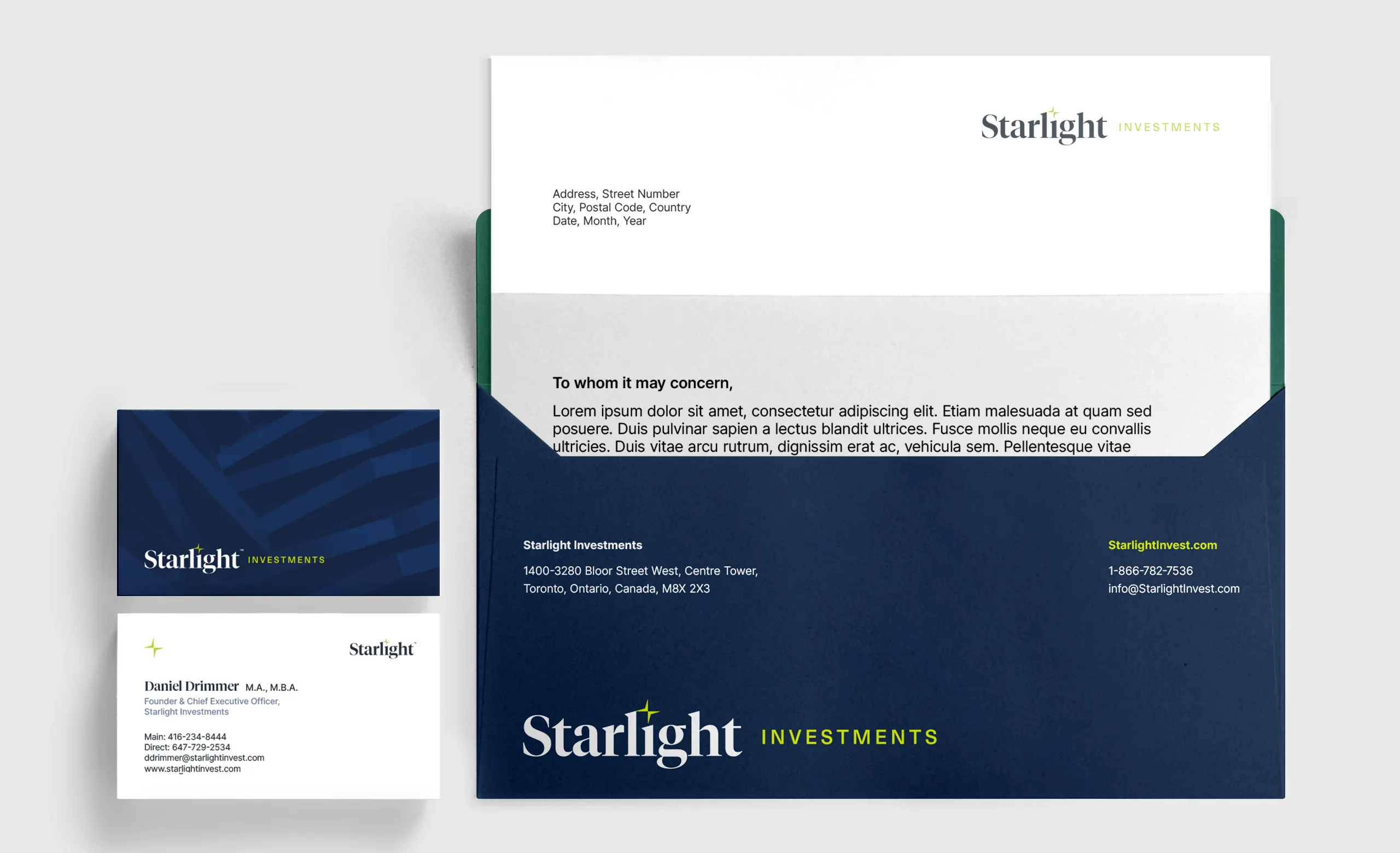
I led the rebrand end-to-end, designing the visual identity and rolling it out across every touchpoint—from logo and brand guidelines to the website and a full suite of communications, including stationery, presentations, and internal documents.
Agency
King Ursa
CREDITS
ECD / Grant Cleland
Design / Matthew Spence
Copywriter / Kevin Hoessler
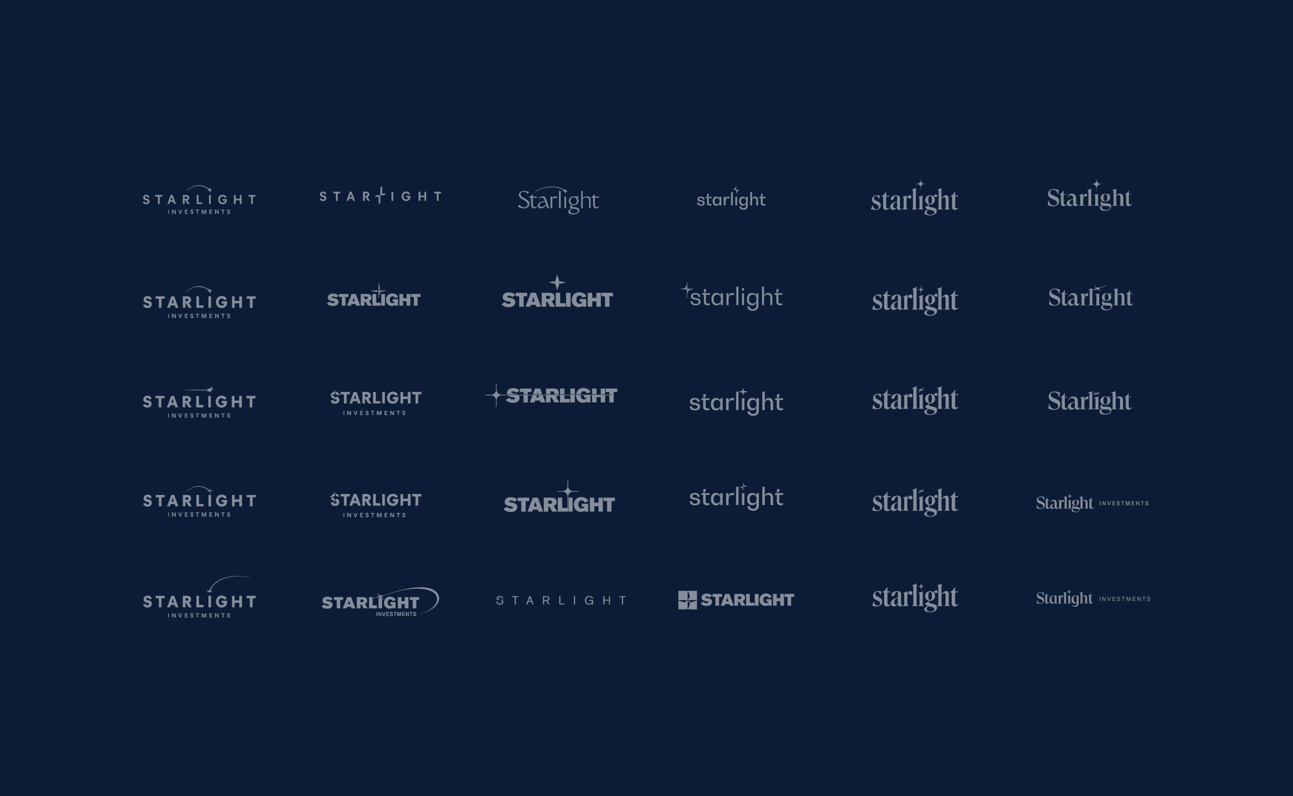
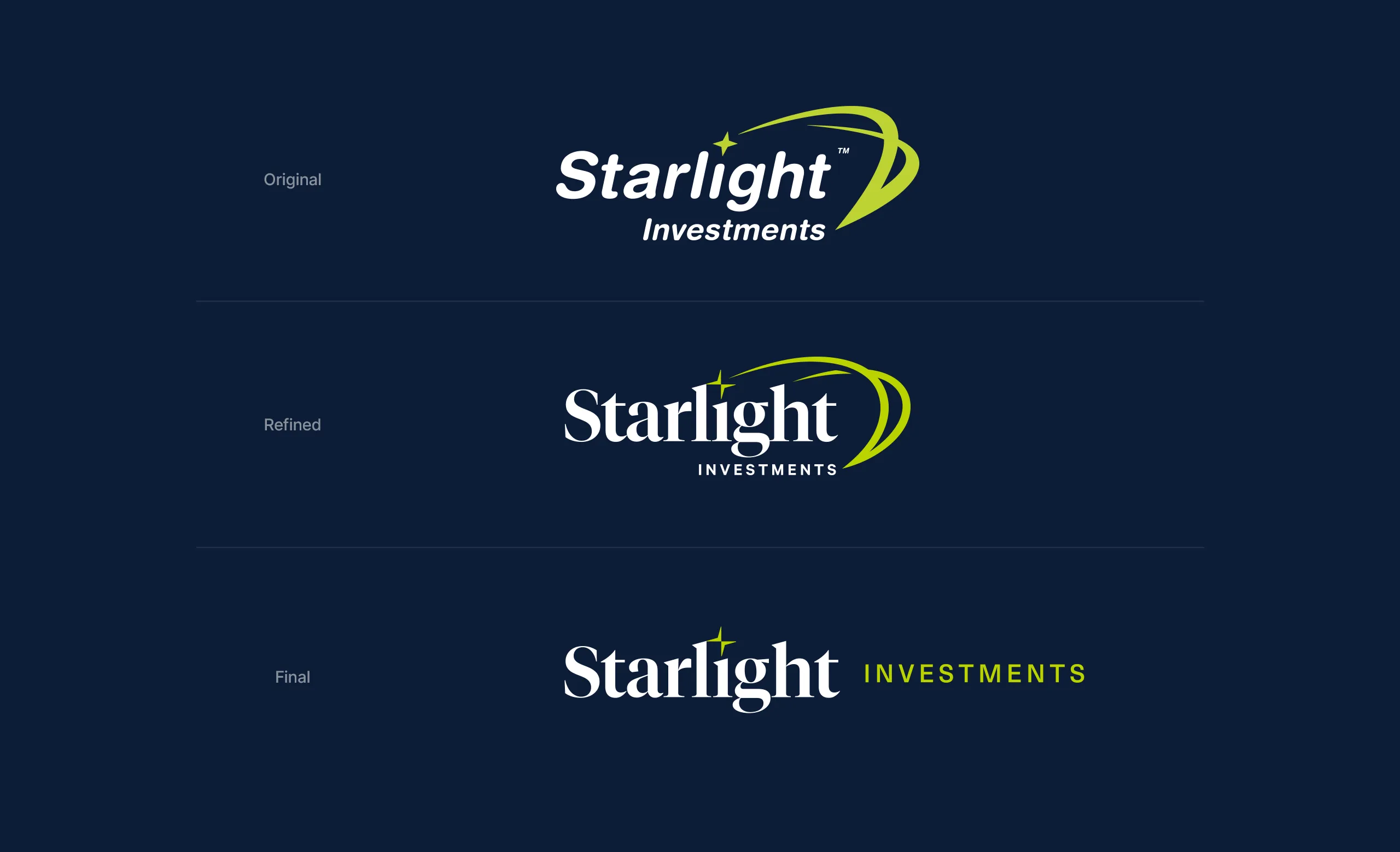
Logo Approach
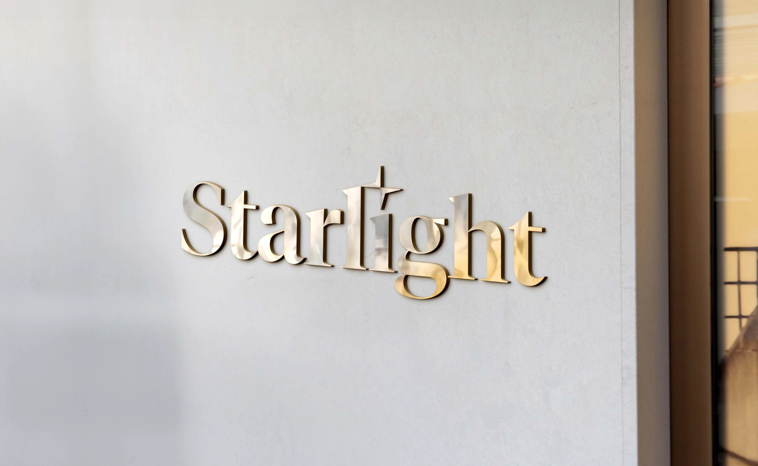
The existing logo had recognizable equity, but lacked clarity and scalability. The swoosh felt disconnected from the wordmark, and the stacked lockup didn’t translate well across applications. The rounded typeface also didn’t reflect the tone of a real estate firm operating at this scale.We explored refinements—simplifying the swoosh and testing stronger typographic directions—but ultimately moved to a more confident wordmark and a horizontal lockup. The result is a cleaner, more balanced identity that scales effectively and better reflects the credibility of the business.